So without any further delay, let me start with what has changed:
The toolbar
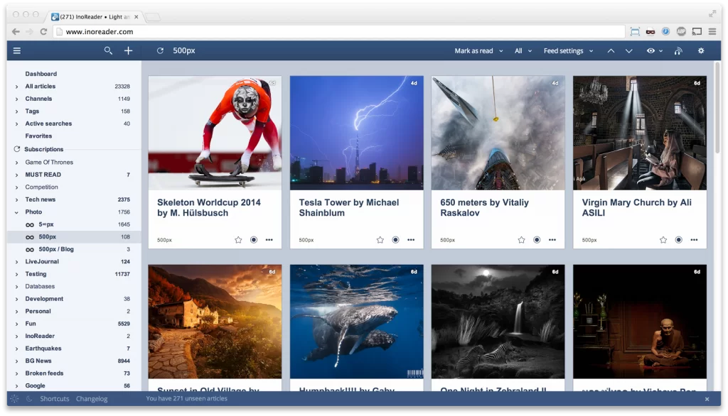
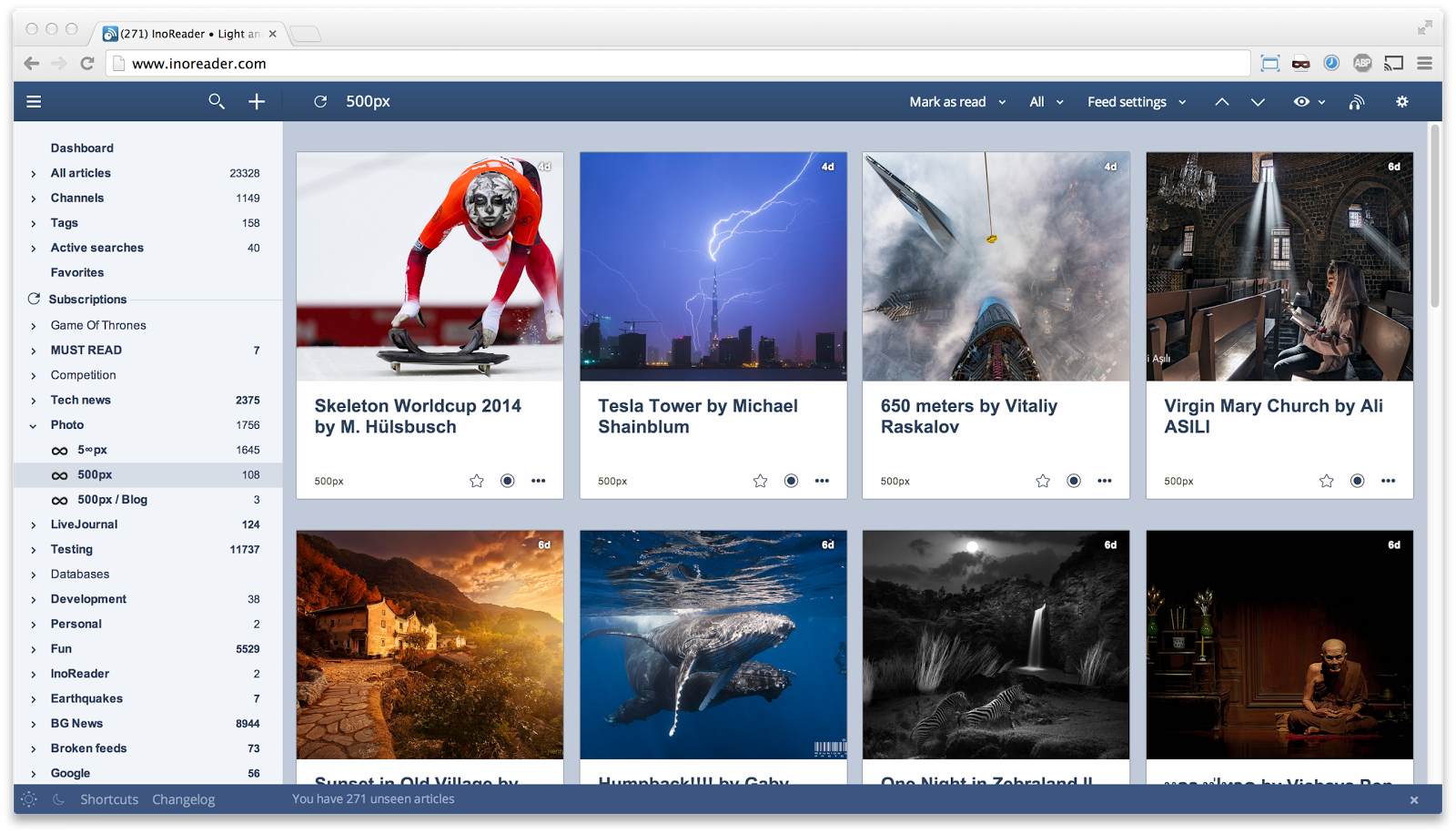
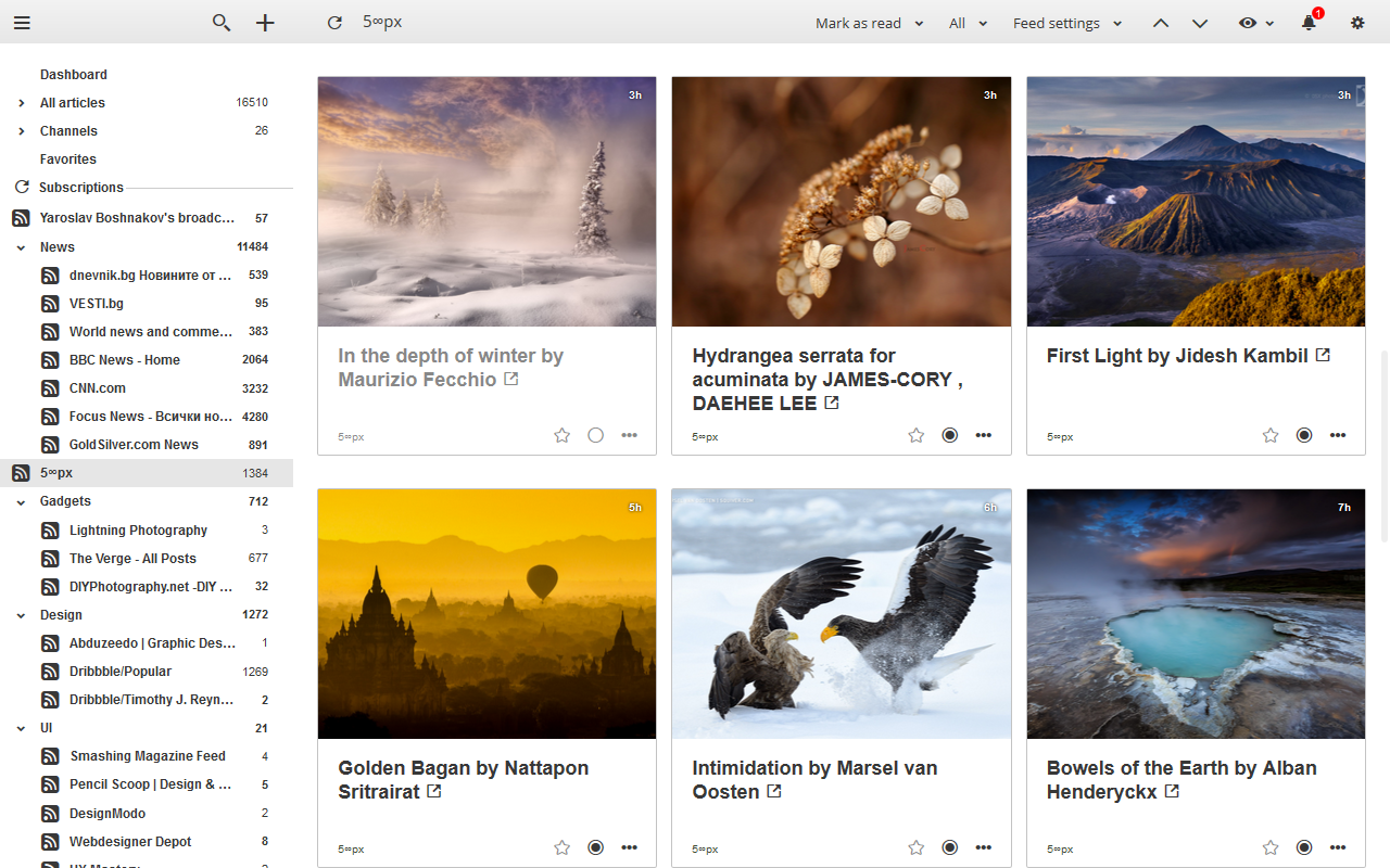
We have put a lot of work in it in order to preserve unique one one-line-toolbar style and we think we have succeeded. One line toolbar means you will have a lot of vertical space for the most important part of the software – the reading pane.
It features a new menu icon on the leftmost side. You can easily dock the tree pane with it. When you hover it later the tree will pop out temporarily and hide again when you hover out. Click it again and the tree will stay open.
The Add/Search combo is next. The two buttons open up a search box with different intent. To search for articles or for feeds. This eliminates the confusion with the older search bar (people often try to add feeds from it).
Next is one of the most important buttons – Refresh. I hope you already know that our refresh function not only reloads the view, but also fetches new posts from the current feed (or folder).
The name of the current section appears next with bigger font size, so now you always know what you are looking at.
Next comes the right aligned part – Mark as read button, All/Unread selection, Feed/Folder/Etc. settings menu, the new View menu which will allow you to select the different layouts, default sorting, etc., the Audio Player (visible only if you have audio files added) and the Preferences menu.
Menus
The menus in the application has also been completely rewritten. All menus (with few exceptions) are now instant, no more “Loading…” messages while waiting for the menu to be generated on the servers.
Icons
All icons have been carefully hand crafted and implemented in vector format, so they will now scale beautifully even on those cool Retina displays.
Dialogs and confirmations
All dialog windows has been migrated from the old framework (jQuery UI) to our shiny new InnoWorks framework, which we plan to opensource in the future.
Preferences
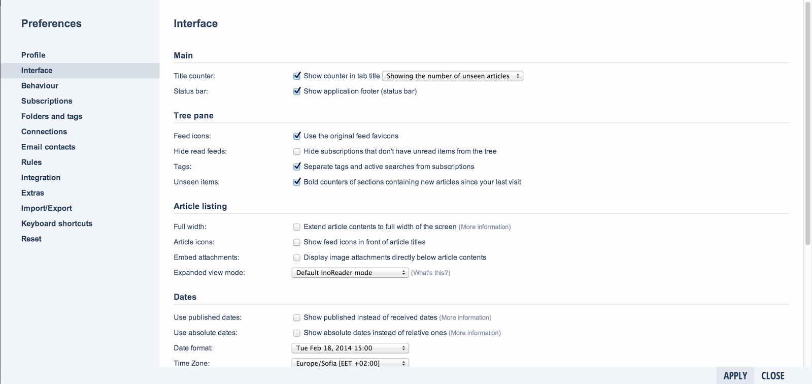
The preferences section has gone through some serious changes also. They were badly needed. The old “Reading” tab is now separated into two “Interface” and “Behaviour” and the settings inside has been grouped into smaller sections
Preferences are still opened in a popup (although bigger) window, so you don’t loose track of your current read.
New views
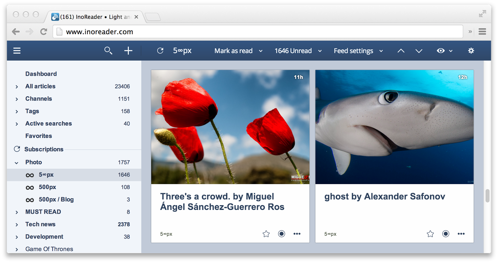
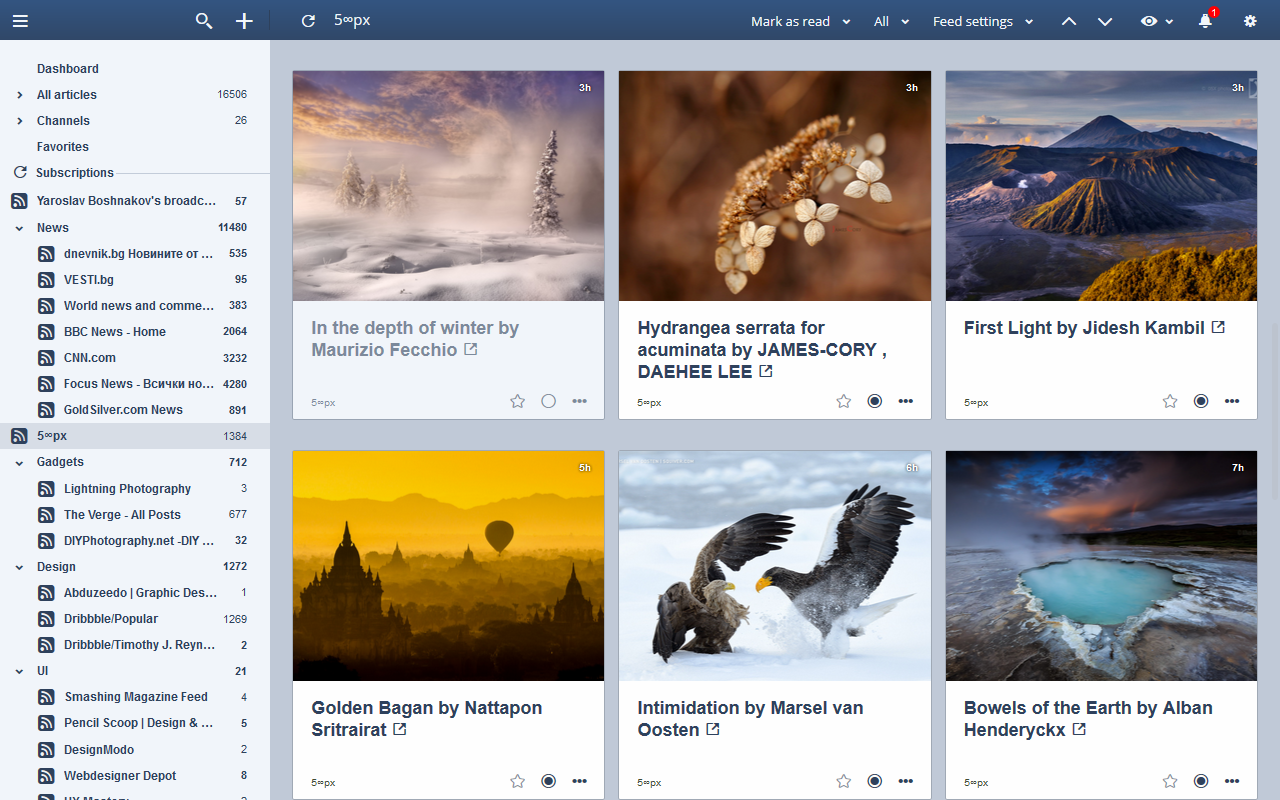
Card view
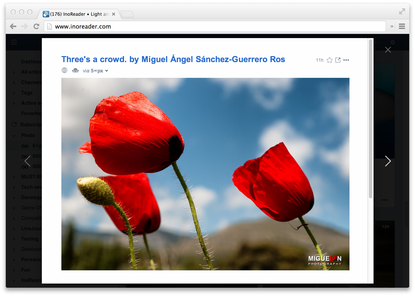
– We have tried to make this the best card view you have ever used. We know you will love it, especially with the right feeds (500px have some awesome ones). Now only you can view your articles as cards, but we have took the extra mile here with the keyboard shortcuts. You can use the arrow keys to navigate between tiles and then open them with your Enter key. Pressing Enter again will stretch the article horizontally to give you the best possible view of feeds with bigger pictures.
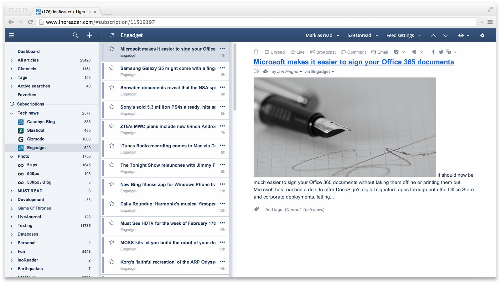
Pane view
The new 3-way pane view will allow you to scan headlines faster, but at the same time not loose the current article. Arrow up and down keys are also handled here.
Dashboard
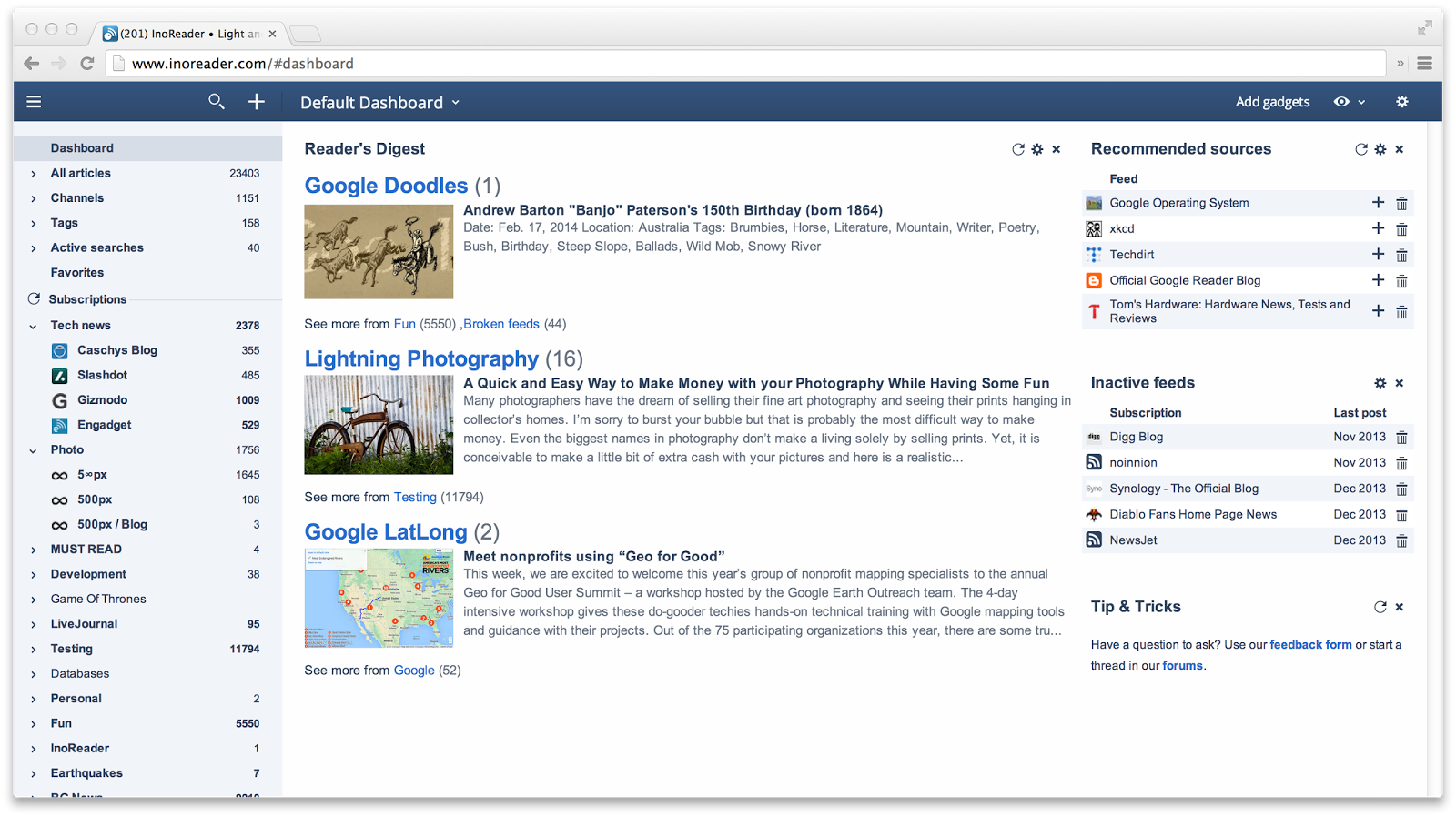
The dashboard is our new Home section. Plus and Pro users can customise it, by adding new gadgets, configure their behaviour and create new dashboards.
The default gadgets should please most users, especially the “Reader’s Digest” gadget which recommends you new posts from the feeds you read the most.
Comments
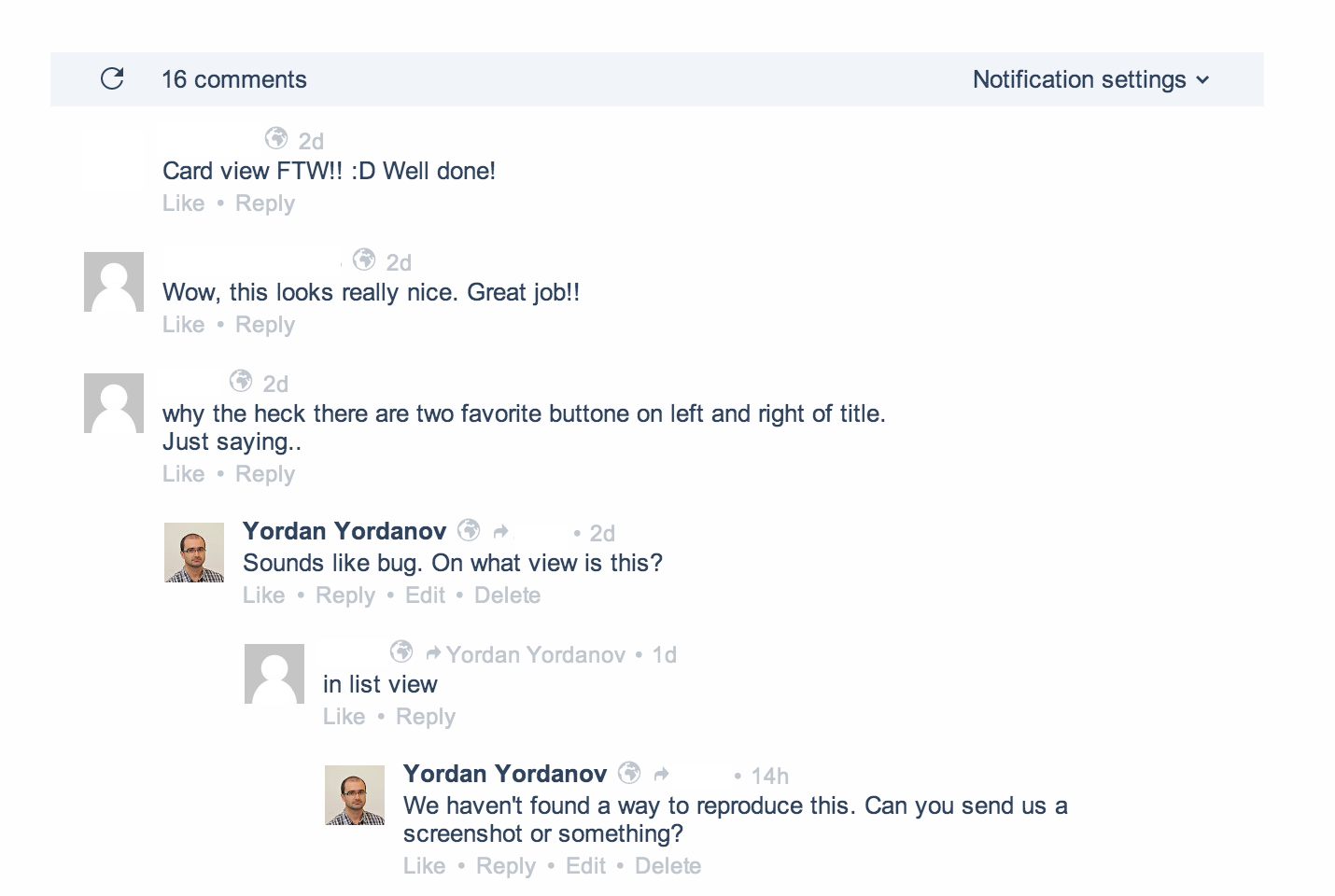
Did you know you can comment on articles in Inoreader? Chances are you didn’t, even though comments are available since the beginning of the project.
At first they were only public, because the idea was to help people with similar interest connect with each other and discuss on articles they like. Shortly after we added the option to have private comments, which can only be seen between connected people.
Today we are upgrading the comments section once again. They are now easier to read and we have added the option to edit your comments as well as like on other comments.
Read more in this post…
Notifications
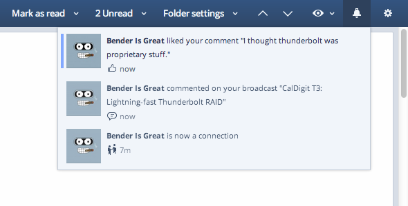
A big drawback of the old social features of Inoreader was the lack of notification system. You can comment on articles, but you don’t know if someone else replied to you. There are email notifications available, but they are limited.
We have improved in this direction also, complementing the new comments with a notification system. In addition to social features, it will be able to notify you for other important things later.
Themes
Our new version introduces new themes also. The default theme is now called Aqua and is in calm blue tones. We have spent a lot of time tuning it so it doesn’t strain your eyes even after hours of reading and browsing.
Then if you like the old looks of Inoreader with higher contrast and brighter colors, you can always switch to the Light theme
Last, but not least a brand new Dark theme is available. It was made from scratch and again all colors were carefully picked to contribute to the best possible night reading experience.
Read more in this post…
Other notable changes
We have a lot of other changes in this version, but this post can go forever, so here is the list of the most important ones:
- The view style is now saved for every subscription and folder. There is also a “Default” view which is set on the sections above the subscriptions.
- You can now set the default order for all feeds from the “eye” menu, but you can also set individual orders in the “Feed options”/”Folder options” menu.
- Performance improvements in the tree pane. It is now up to x2 times faster than before especially for users with huge number of feeds.
- Right aligned counters in the tree for better readability.
- Removed “unseen” colors from the tree. Instead the counters will now be bold.
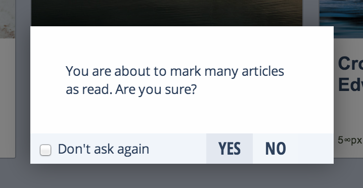
- Option to “Mark all as read” by clicking on the unread counters.
- Undo option for “Mark all as read” when used from the tree.
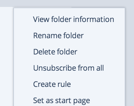
- Right-click menus in the tree pane, because of the new placement of the counters. The same menu is of course always accessible for the current section from the toolbar.
- The “Draggable splitter” has been removed for performance reasons. Instead now you can use three presets (narrow, normal, wide), available in the tree menu (the gear icon above subscriptions).
- Added Expand/Collapse all option in the tree
- Improvements to the address book (batch delete of contacts)
- Added relative dates (1m, 1h., etc.). You can turn them off from Preferences -> Interface -> Dates.
- Added an option to disable the transfer of tags to Evernote and Pocket
- Fixed some issues while sending articles to Evernote
- Statistics section have been moved under the gear button on the right (below Preferences).
- And a lot more…
